

Creating a New App Concept
Creating a new app and developing prototypes with Figma and a remote team during my Master's program
OBJECTIVE
-
Create a new app concept for a class in my Master's program
-
Develop a prototype for the app in Figma
-
Ensure the app meets WCAG guidelines
RESULTS
-
The "FieldDay" app, made for the traveling sports fan
-
Development of a design system in Figma for future updates
-
Updates to app design choices to align with WCAG guidelines
Background
- Master's degree class on UX design at Northwestern University
- Project: "Develop an app or web service concept using Figma and other tools"
-
Other tools included Miro, LettuceMeet, Slack and Draw.io
- Deliverable Requirements:
-
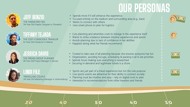
User personas
-
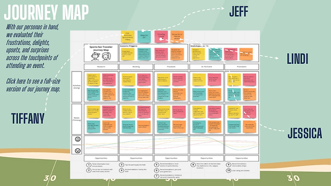
User journey maps
-
Design guide
-
App prototype
-
Final presentation explaining work
- Team of five classmates:
-
4 based in USA, 1 based in South Africa
Strategy
- Beginning-to-end app development
-
Hypothesizing over what to build
-
FieldDay was a combination of several ideas, from a sports history app to finding hotels to selecting restaurants in new cities
-
-
FieldDay was designed to help traveling sports fans
-
Tickets, parking, restaurants, souvenirs, hotels – a one-stop shop for traveling sports fans
-
- Development plan:
-
Conduct user research
-
Gather requirements from frequent travelers + sports fans
-
-
Create affinity maps based on user interviews
-
Develop user flow diagrams based on affinity maps
-
-
Develop prototypes in Figma
-
First lo-fidelity then high-fidelity
-
Finished Deliverables
- User Personas
- User Journey Map
- Design guide


- Low-fidelity app prototype
Recent Redesigns
- The old app prototype needed a facelift
-
Misaligned objects, colors used in inefficient places, highly square UI made the low-fidelity prototype look and feel amateurish
- I used Figma to give this app some much-needed user interface updates but gave myself some rules:
-
Use the same style guidelines from the project's design book
-
Maintain the same functionalities my group and I originally made
-
Follow mobile device UI best practices as outlined by the WCAG
I used a Figma community web kit to help myself make a new design system
-
This provided me the following benefits:
-
Expedite my workflow
-
Ensure I don't need to make my own assets entirely from scratch, saving time
-
I customized my components to better suit my app
-
This included CTAs, menu bars, font choices and creating a new section allowing users to choose seats at a game
-
All of these changes were verified to be accessible up to at least WCAG-AA ratings
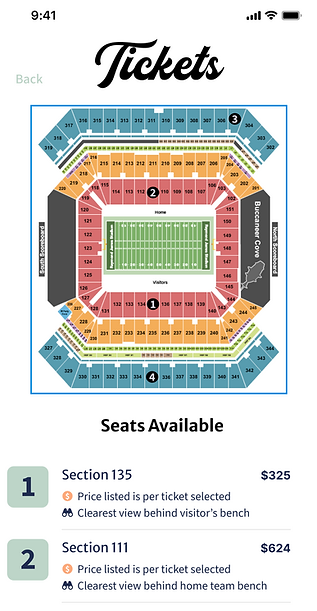
A redesign of the seat selection functionality in the FieldDay app, late 2024.
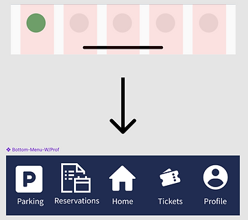
The original web kit's bottom menu was bare bones so I changed it into a menu that suited the FieldDay app.
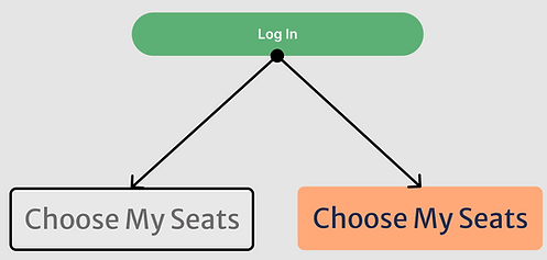
I adjusted the web kit's Log In button into a call-to-action (CTA) that would better suit my app and user needs.